

Featured Extensions
2026-09-24
2026-09-23
2026-09-23
2026-09-22

 Sociable 3.3.4JReviews 6.7.1JSitemap Pro 4.32.1Quix Pagebuilder 6.4Academy LMS Pro 4.1

 Overview

 Joomla ExtensionsAccess & SecurityAdministrationAds & AffiliatesAuthoring & ContentCalendars & EventsClients & Communitieschats and ForumsContacts & FeedbackContent SharingCore EnhancementsDirectory & DocumentationStyle & DesignSite Managemente-CommerceEditorsFinancialHosting & ServersLanguagesLivingMaps & WeatherMarketingMigration & ConversionMiscellaneousSearch & IndexingMobileMultimediaStructure & NavigationNews DisplayBooking & ReservationsReal Estate and jobsPhotos & SlideshowSocial WebExtension SpecificSports & GamesToolsNewsletterSeo & metadataContent ConstructionformsPopups & iFramesBackupHelp Desk And SupportpollsData Import & ExportTable and listLogin/RegisterMenu SystemsUser & ProfileportfolioTabsRss FeedDatabase Managementdate and timePayments Site Analyticsjoomshoppingk2 extensionsAltaUserPointsVirtueMartHikaShopj2storeDJClassifieds Digicom ExtensionsJoomla TemplatessmartaddonsjoomshaperJoomDev templatesLthemeOrdaSoft Templatesinspirethemevinagecko templatesthemeforestyoothemeShape5Template monsterJoomlashine(JSN) TemplatesRsjoomlaRocket ThemeHOTthemeswarpthemejoomlarthtml templateGavickProBowthemejoomla51bestaddonjoomlabuffJoomla MonsterCmsboldjoomdonationJoomlabambooThemexpertjoomlaplateExtensions for joomlastackideasNooTheme9themestoretemplazamixwebtemplatesagethemesDj-extensionsJoomLeadVirtuemart TemplatesMobile JoomlaUnitemplatesJoomlaschoolWordpress PluginsWP Admin ToolsWP AdvertisingWP BackupWP Popup And IframeWP Calendars & eventWP Coming SoonWP Directory & ListingsWP E-Mail & NewslettersWP FormsWP ForumsWP Photo & GalleriesWP Help Desk – Live ChatWP Import & ExportWP Interface ElementsWP LMSWP Maps & WeatherWP MultiMediaWP User & ProfileWP Menu DesignWP MarketingWP language and speechWP news DisplayWP Page BuilderWP PaymentWp Access & SecurityWP SEO & OptimizeWP sports and GamesWP SliderWP Social Media PluginsWP UtilitiesWP shopWP Login And Registerwp Booking & Reservations wp Search and FiltersEDD PluginsWP file and downloadswp contact & feedbackWP Table and listWP Style & DesignWooCommerce Pluginswordpress Themeswp Blog templateswp BuddyPress templateswp Business templateswp Corporate templateswp Creative templateswp Directory & Listings templateswp eCommerce templateswp Education templateswp Miscellaneous templateswp Mobile templateswp Multi Vendor templateswp Multipurpose templateswp Newspaper – Magazine templateswpReal Estate templateswp Technology templateswp Restaurant templatesMagento ExtensionsPrestashop modulesPrestashop TemplatesSoftwaresLearningother ScriptsMobileApp And Source CodesWeb design & Graphics ToolsFree Downloadfontsshopify TemplatesAI Tools

Motion is a Joomla 2.5 / Joomla 3 template that features an elegant implementation of the now ubiquitous parallax effect. Scroll up and down the page and watch as the grasshopper, donkey and birds play peak-a-boo behind your content .
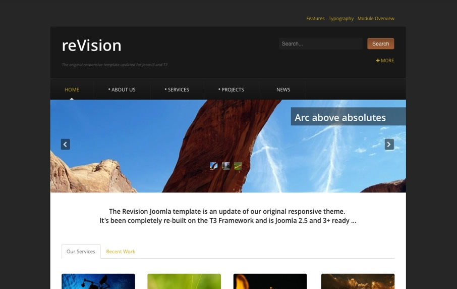
Revision is a Joomla 3 and T3 update to one of our favourites from our back catalogue. Since it was first released in 2008 Vision has been used for countless business, travel, blog, portal, and magazine websites
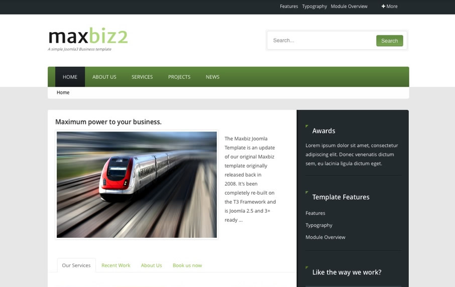
MaxBiz2 is an update to our simple business Joomla template released in 2008. MaxBiz2 retains the simple design aesthetic of the original but with a little more flair, a lot more passion and a tonne more power under the hood
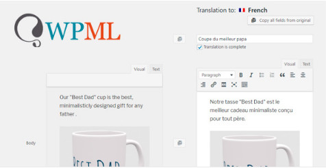
The WPML Media Translation add-on allows you to show different images for content in different languages.
On This Page:
Understanding When to Use WPML Media Translation
Activating WPML Media Translation
Using Different Images and Media Across Languages
Media Translation Settings

DM XML Exporter for K2 lets you export K2 articles in XML files. At any time, you can access a specific URL for each of your K2 categories, getting an XML containing articles' data (title, keywords, creation date, author, category, fulltext, image, meta tags).
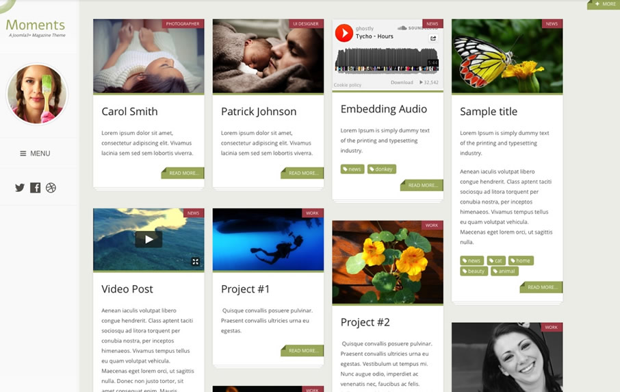
Moments is a flexible, responsive Joomla template designed to bring your content into focus. It's part magazine, part blog, part gallery and part what ever you like .
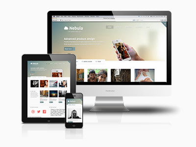
Nebula merges soft, blurry header elements with crisp lines and lots of white space. It's the ideal theme to showcase your design business, your cutting edge app or pretty much anything else ..
WPML gives you the option to choose which content you would like to translate and send it for translation via the Translation Dashboard. You can set up this content to be translated by yourself, other users of your site, or professional translation services.

This extension for MijoSearch component provides advanced searching with custom fields for RSEvents!Pro component.
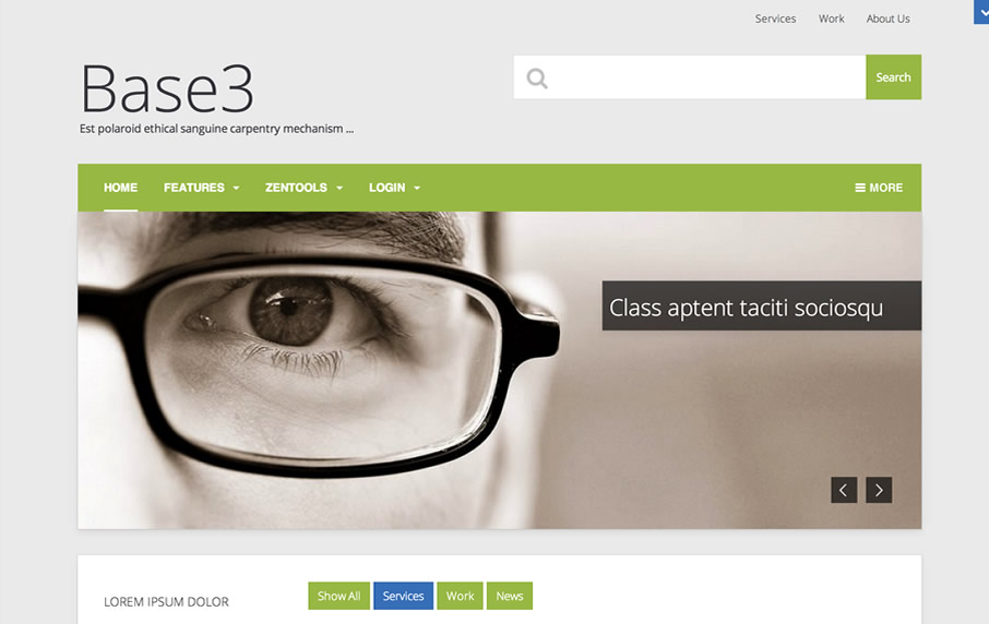
Base3 is a simple starter theme for Joomla 3. It's built on Bootstrap 3 and T3 and while it's a fully featured responsive Joomla 3 template it's visually very clean so you get all the features and none of the visual clutter. A perfect starting point.
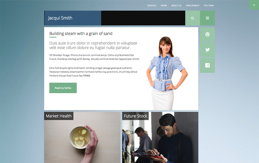
Give your client a web site with a clean and corporate feel. Slick, sleek and professional, Client will deliver power and flexibility for your next Joomla project.
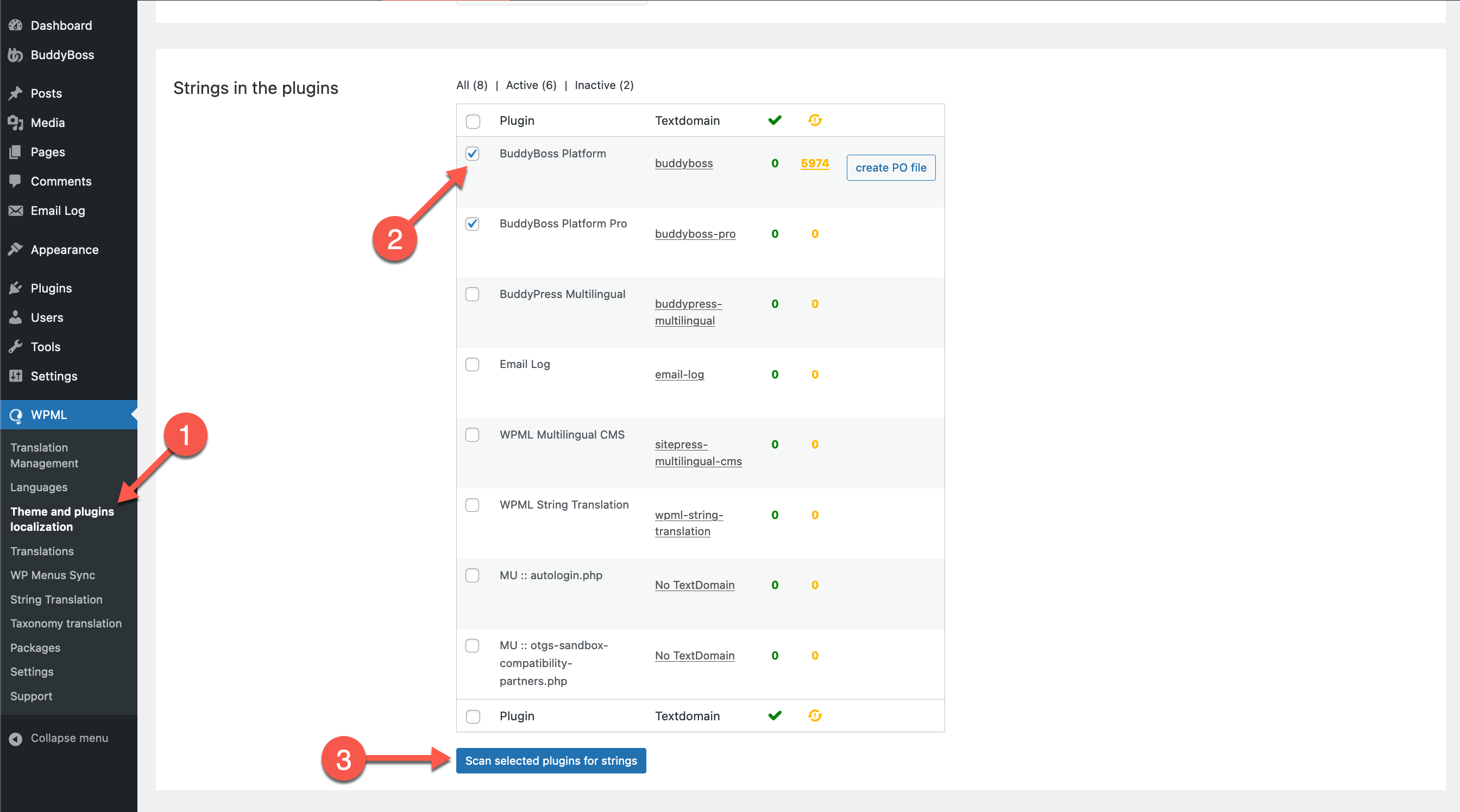
BuddyPress and BuddyBoss turn your WordPress website into a social network, add forums, groups, and even offer memberships and courses. To translate sites built on these platforms, you’ll need WPML’s BuddyPress Multilingual glue plugin
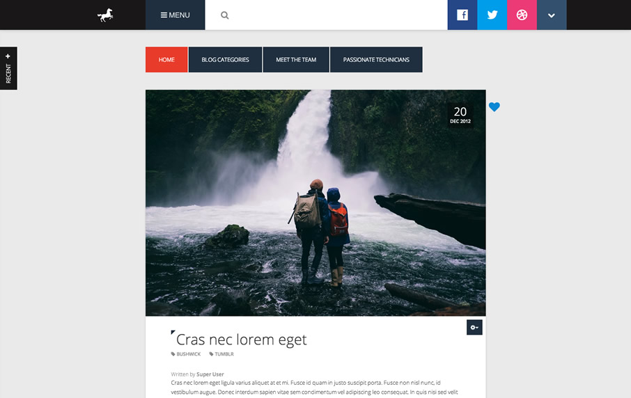
Whether you are running your Joomla blog with Joomla, K2 or Easyblog, Novus is the theme for you. Take your blog to the next level with the Novus Joomla template.

Dripping Menu is a flash dynamic menu module for your Joomla! website, designed to meet your needs and preferences.
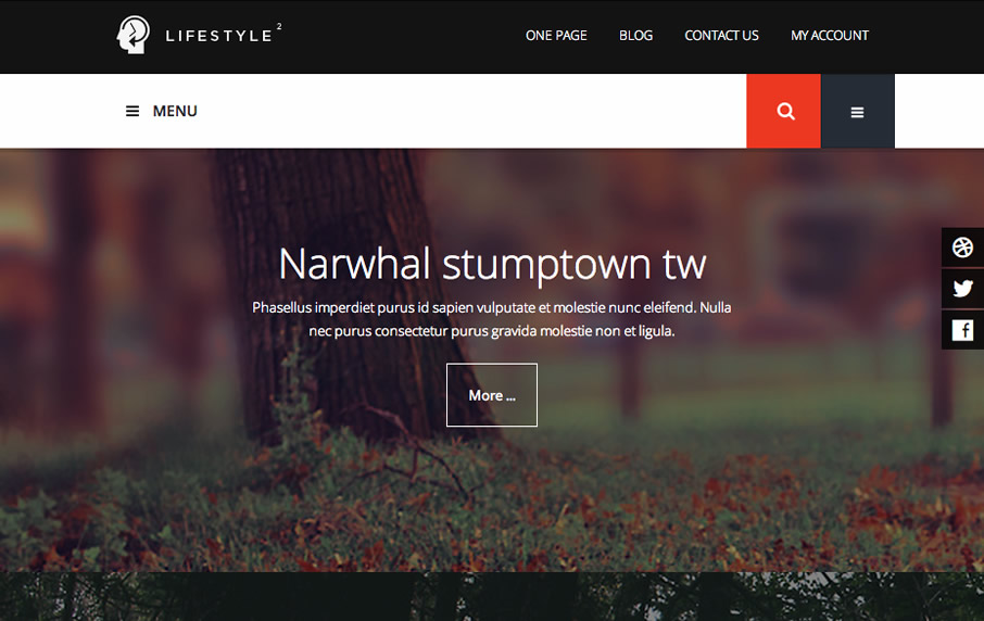
More than just a way of life, Lifestyle2 is designed to be a super flexible full width responsive template for any Joomla site. Built on Bootstrap 3 and T3 it's the ideal partner for your next Joomla venture.
FLEXIBLE, FULLWIDTH, RESPONSIVE ...
Lifestyle2 is a 2014 update for one of our more popular responsive Joomla templates - Lifestyle. Lifestyle2 features a number of design and functionality improvements including a leaner flatter design, full bootstrap and T3 support which means you get the added bonus of almost universal Joomla extension support plus a powerful framework with modern responsive features built into the template.
Get animated with Zentools
The Lifestyle2 demo features the latest version of our Zentools module now has the ability to smoothly slide and fade your images, title text and more in when the content appears in the content.
A new stacked layout for Zentools
Zentools has also been updated to feature a new layout called stacked. Stacked balances full width fixed background images beneath your content items in order to create a faux parallax effect.
Responsive template design
The Lifestyle2 features an intelligent responsive design that changes it's display
depending on the size of the screen your visitor is viewing your site with. This means that you only need a single design
to work on the multitude of tablets, phones, laptops and desktop screens that your visitor may be viewing your site with.
 joomlabamboo
 2022-11-15

